A Cartoonist's
Playground
|
In this blog I'll share my
experiences navigating digital art and cartoons. |
|
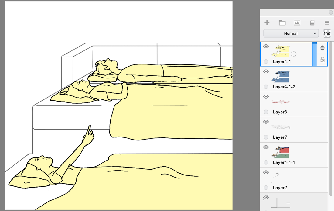
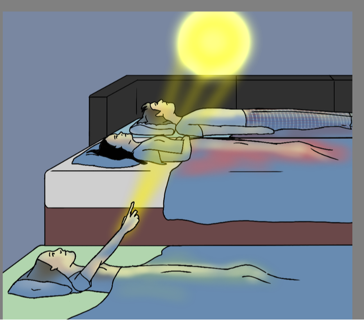
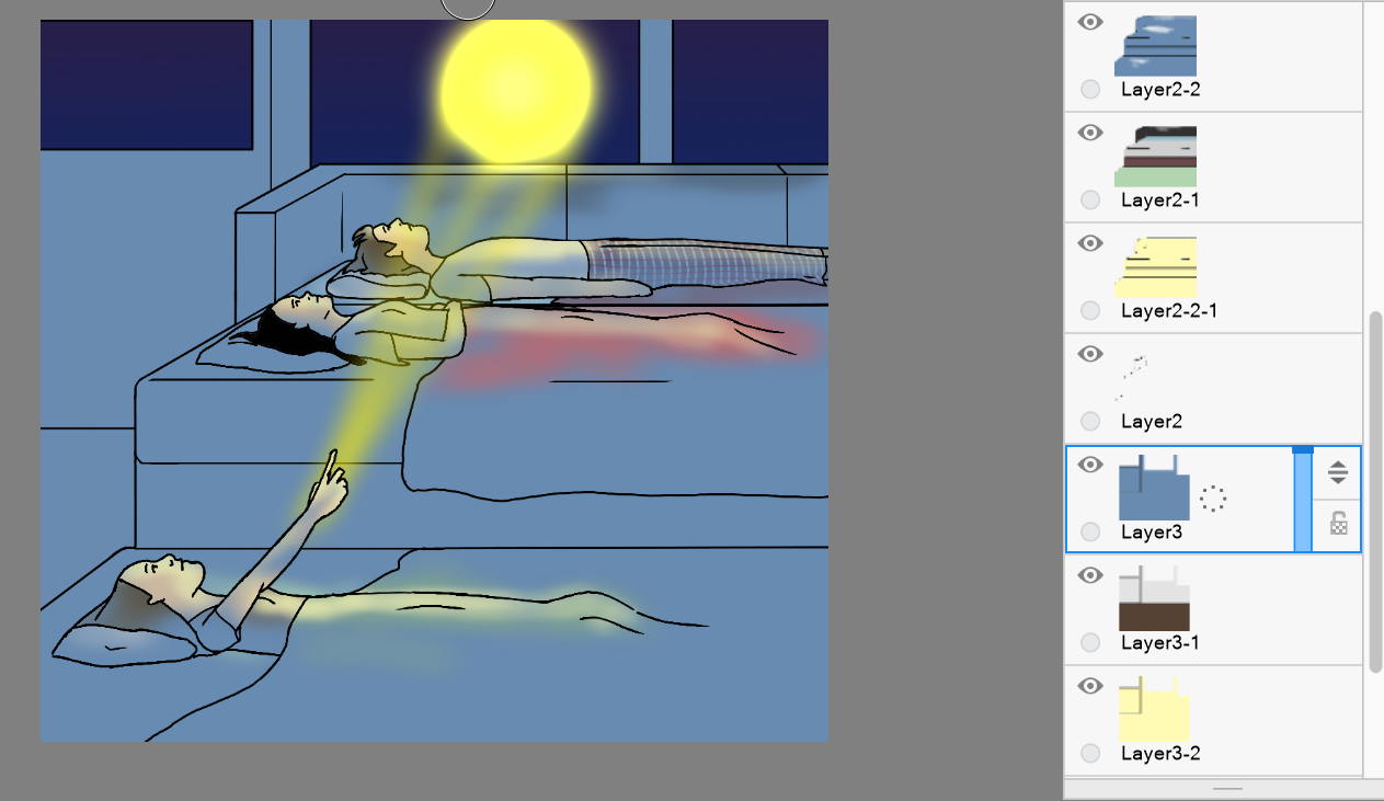
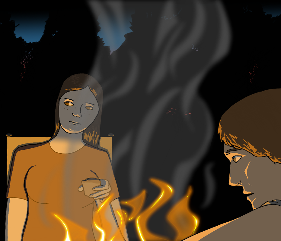
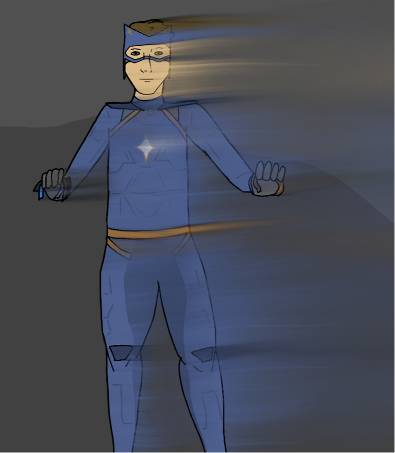
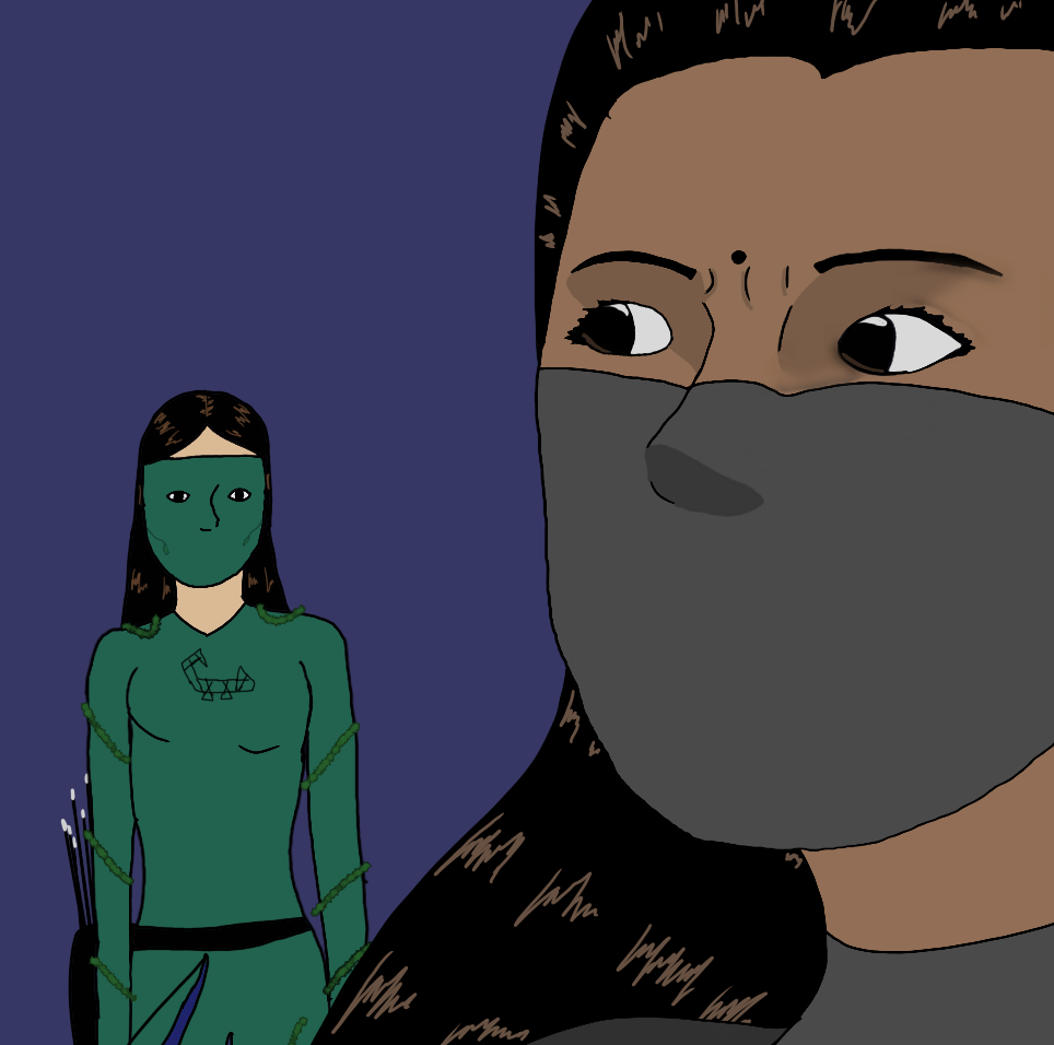
This tutorial will cover how to do realistic lighting shading using digital art software such as in the art below. For simpler lighting and shadows, see my Three Tone Lighting post.
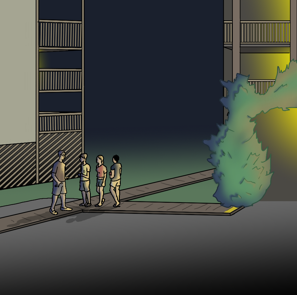
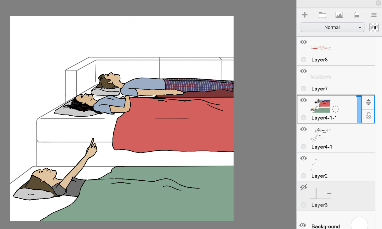
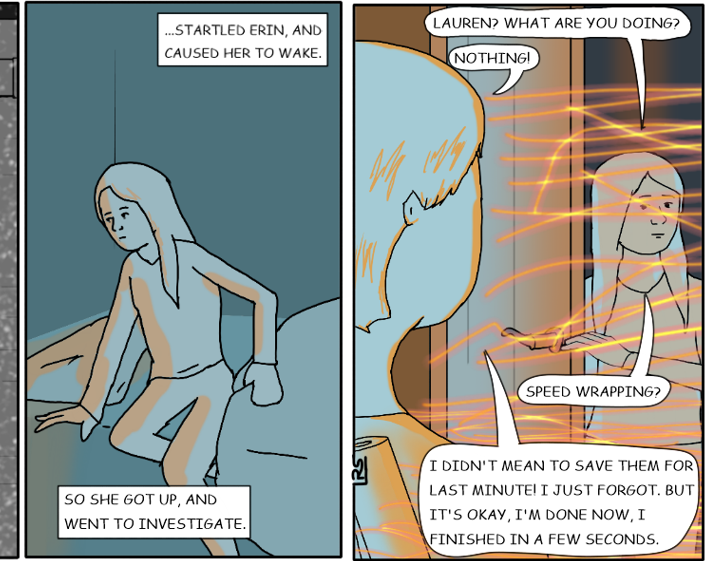
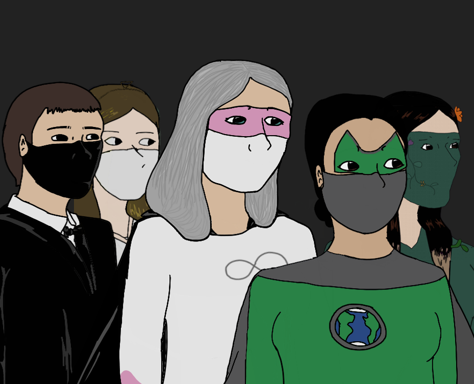
Art from my Superheroes comic strip. Tutorial Note: I use Autodesk Sketchbook for my art. There are other digital art softwares you can use as well. For this tutorial you need one that allows you to make layers. Step 1 Draw your picture. Don't color it yet! I recommend using at least two layers: one for the foreground and one for the background.
Step 2 Duplicate the layer and color it in full color. Use the full color as if it was in broad daylight. Don't draw shadows. (The other layers will act as shadows.) You need to duplicate it because you are going to color this drawing in multiple different ways. If you were to duplicate it after you colored it the fill tool might not work as well if you used dark colors (similar to the black outlines) or if one section was colored black. When you tried to change the color later the whole outline would change to the new color. That's why I recommend duplicating it first.
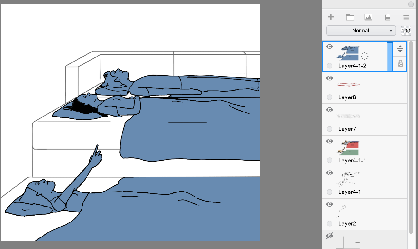
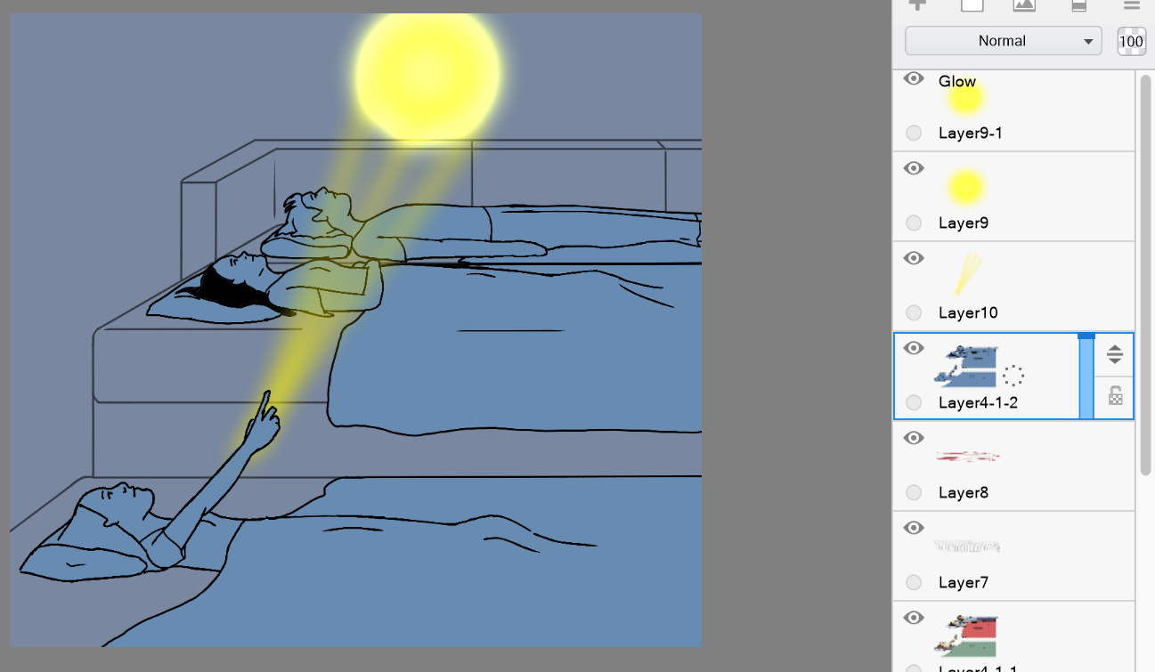
Step 3 Duplicate the original layer again. This time color everything in the shadow color. For this picture I am using a greyish blue for this. I suggest that if something is black in the full color version you color it black here as well.
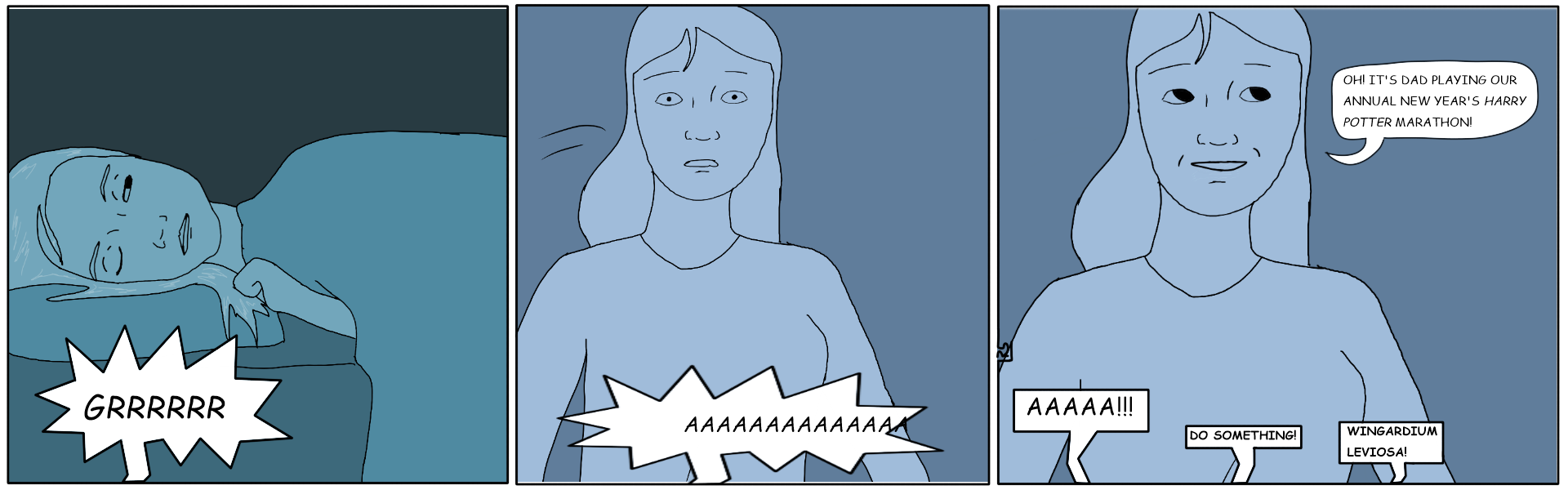
Often in cartoons and comics dark scenes will be drawn in blue:
Step 4 Now color the last duplicate the highlight color. This color will change depending on the color of the light source. My light source will be yellow so I made the highlight color a whiteish yellow. You may make another copy for coloring or use the original layer itself. If you foresee yourself wanting to change the lighting later or starting over with the coloring you might want to keep a duplicate of the drawing that is unedited. If you hide this extra layer you can keep it out of view of the final drawing but be able to use it again later if needed. I do this a lot if I think I might mess up or want to start over.
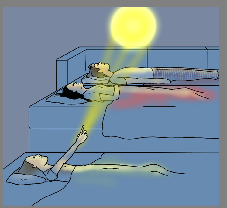
Step 5 Order the layers. You'll want the full color one in the middle. I suggest you use the dark layer on top, full color in the middle, and highlight on the bottom. This may seem unintuitive, but it will make the next steps easier, especially if the picture is mostly dark with a few highlights. Step 6 Draw in your light source. Mine is a ball of light summoned by one of the characters.
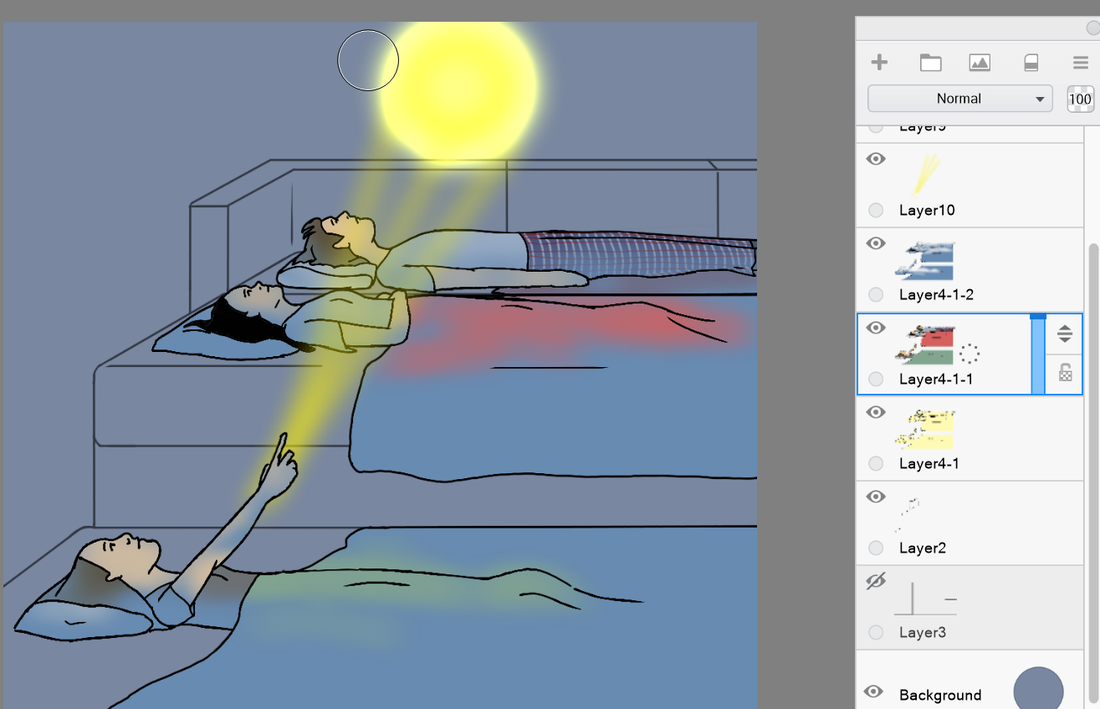
Step 7 Use a soft eraser brush and erase the dark layer. This will show through to the lighter, full color layer below. Erase where the midground would be. Note: You may want to save a duplicate of the layer in case you mess up or want to change it later. You will need to hide this layer so it doesn't appear in the final drawing.
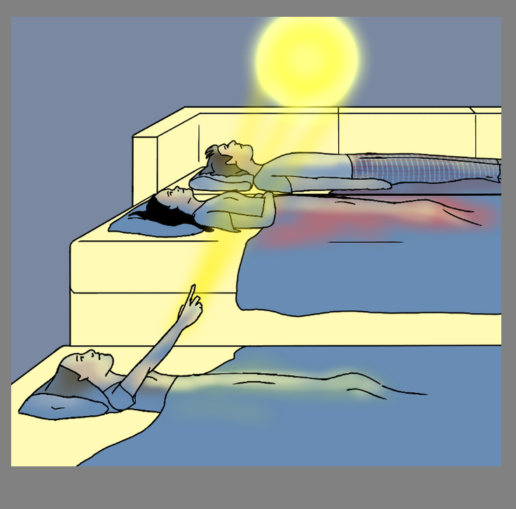
Step 8 Now do the same thing on the full color layer. Erase where the highlights are. (Again, you may want to save a duplicate layer before you erase.)
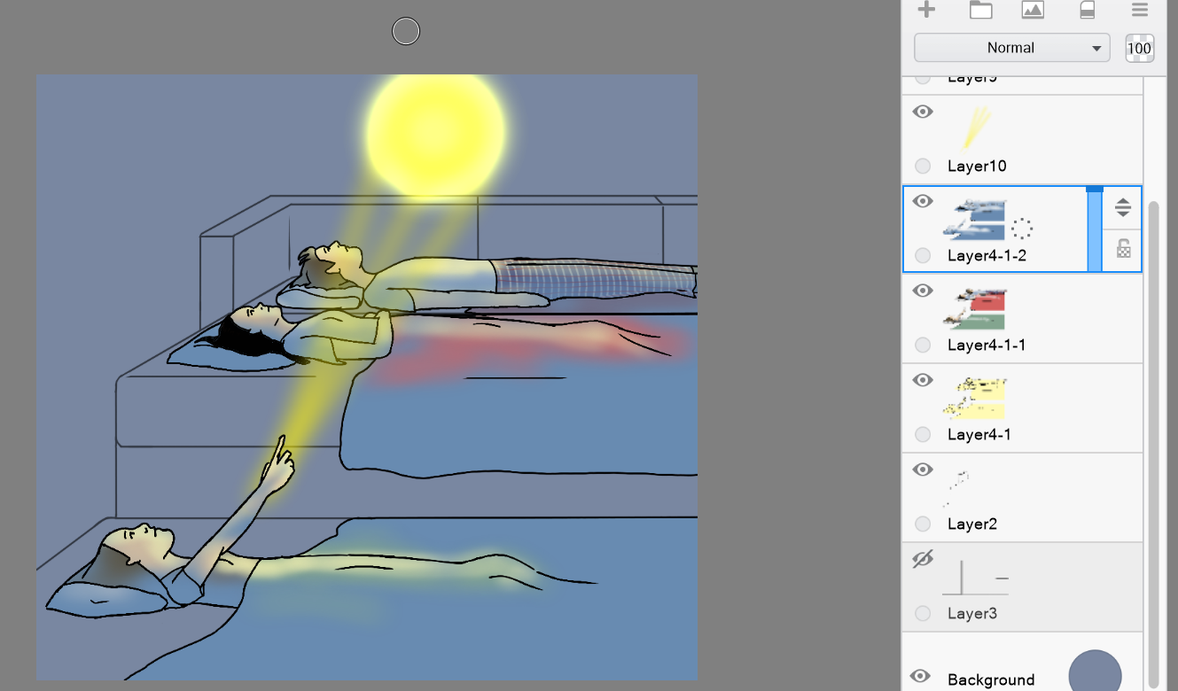
Step 9 Now color the midground layer. Do the same thing as before. Start with the color and then do dark and highlight versions. (You may not need a highlight version depending on how much light your midground will get.)
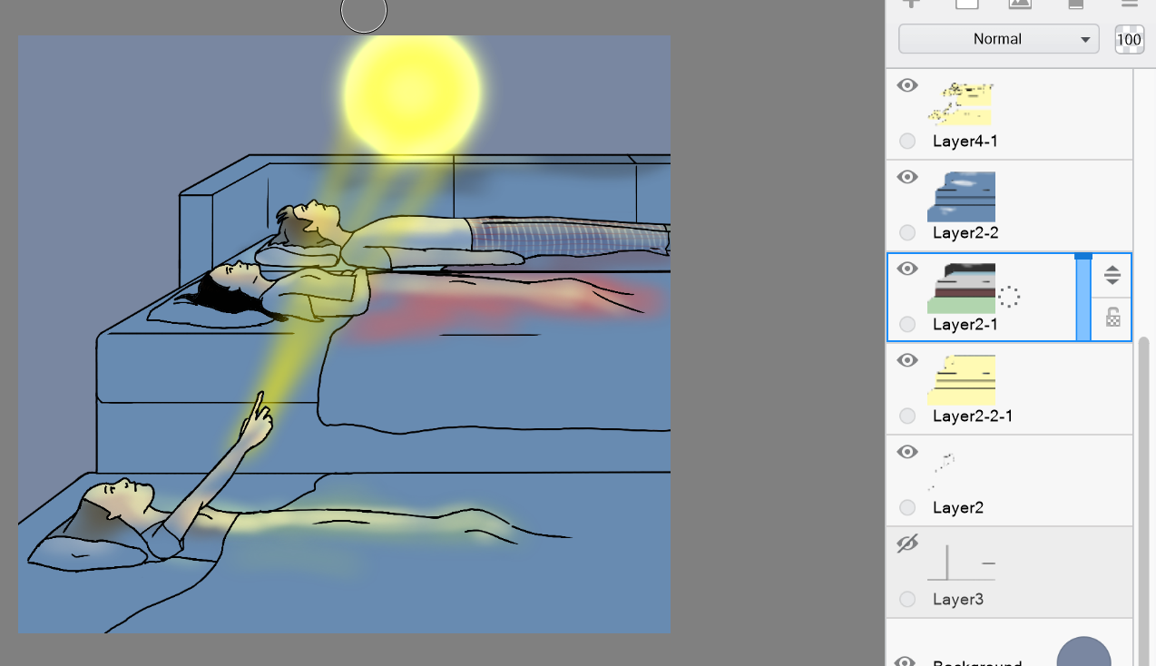
Step 10 Do the same process you did with the foreground to color the highlights and shadows.
Step 11 Do the different layers again for the background.
Step 12 Do the shading and finish any last details! Finished!
4 Comments
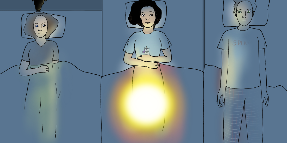
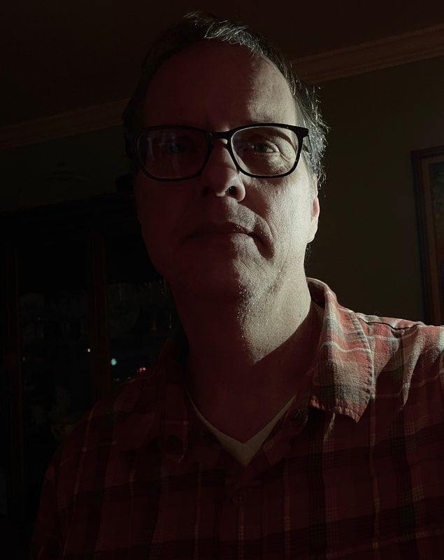
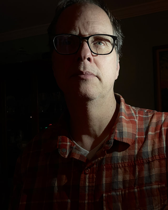
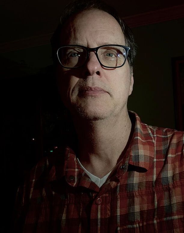
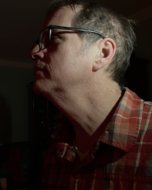
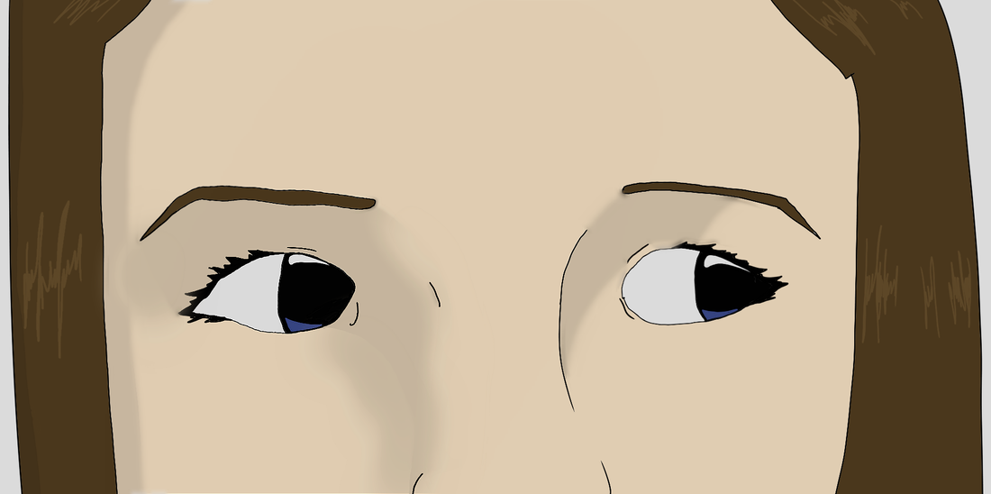
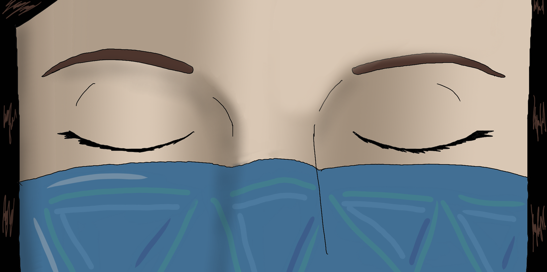
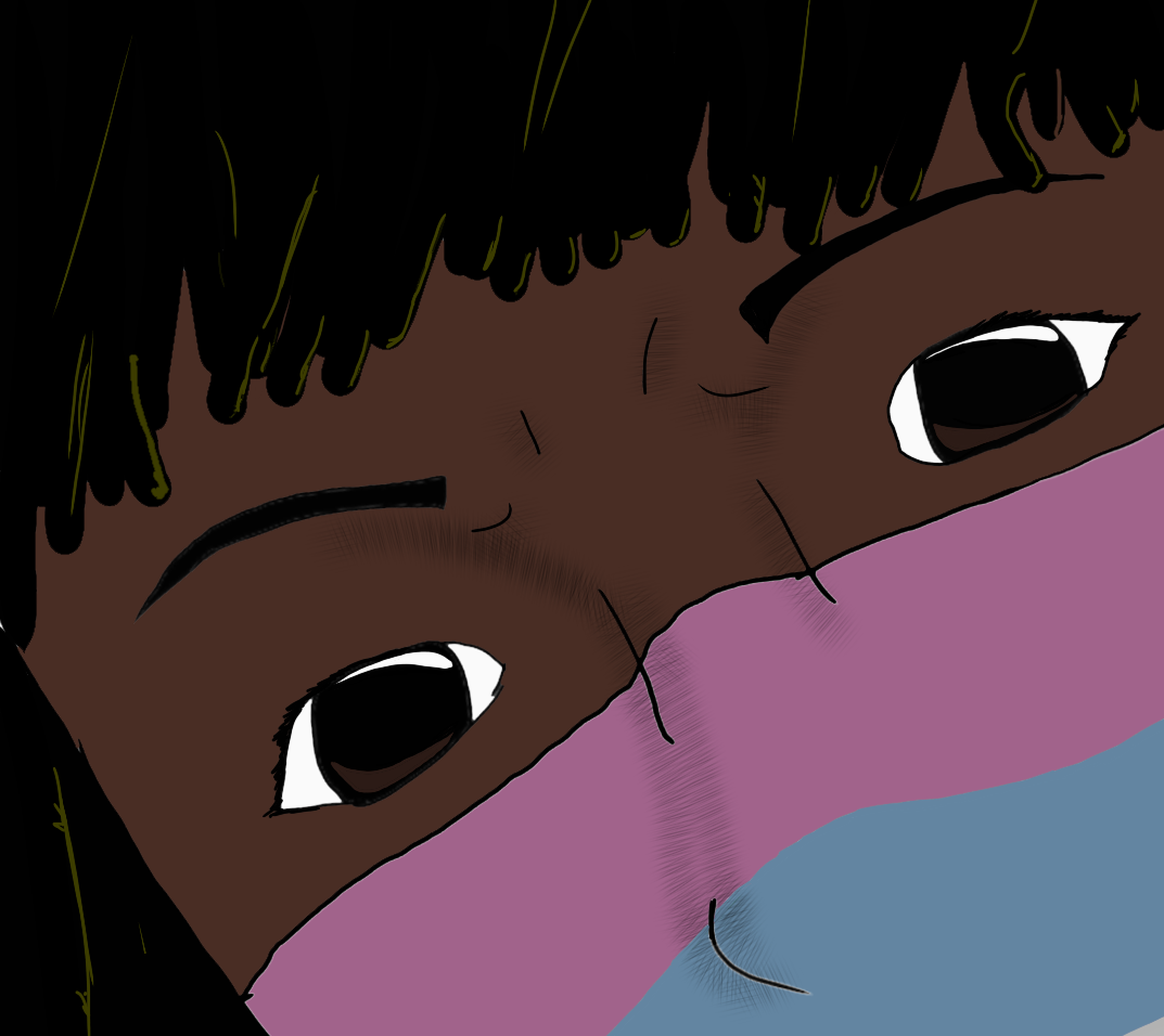
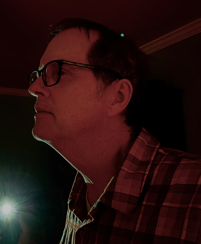
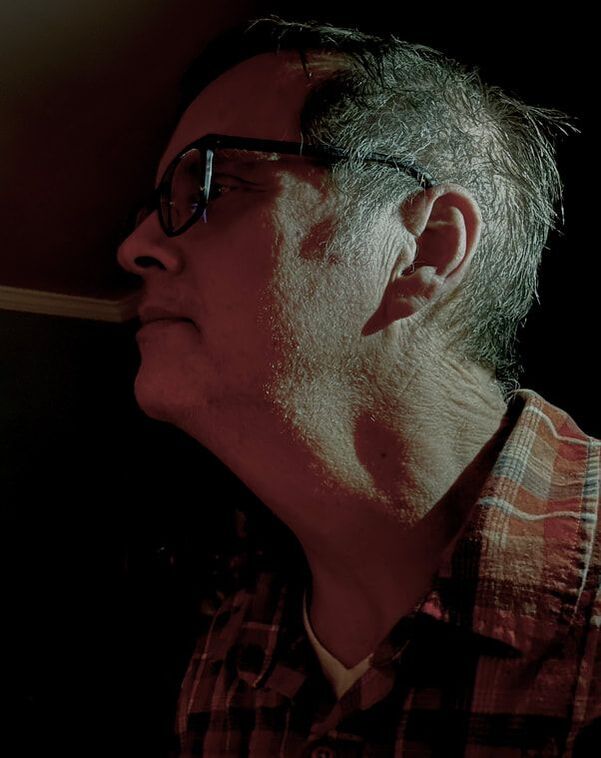
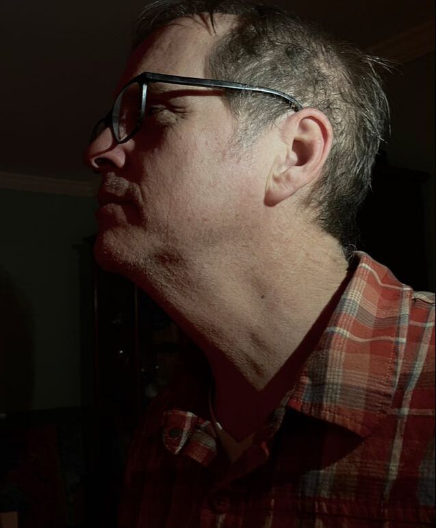
One trick I like to do to make my pictures look more realistic is by drawing multiple sections of different illumination. Three is the most common. These are usually shadow, mid-tone, and highlight. I have briefly talked about this before in my shadows post, however I'll expand on it now. I'm going to mostly focus on faces as that is where this trick is hardest to implement. Placement of Shadows on Faces I showed these pictures before in the shadows post, but I'll show them here again as I think they really help visualize what's going on with light on the face.
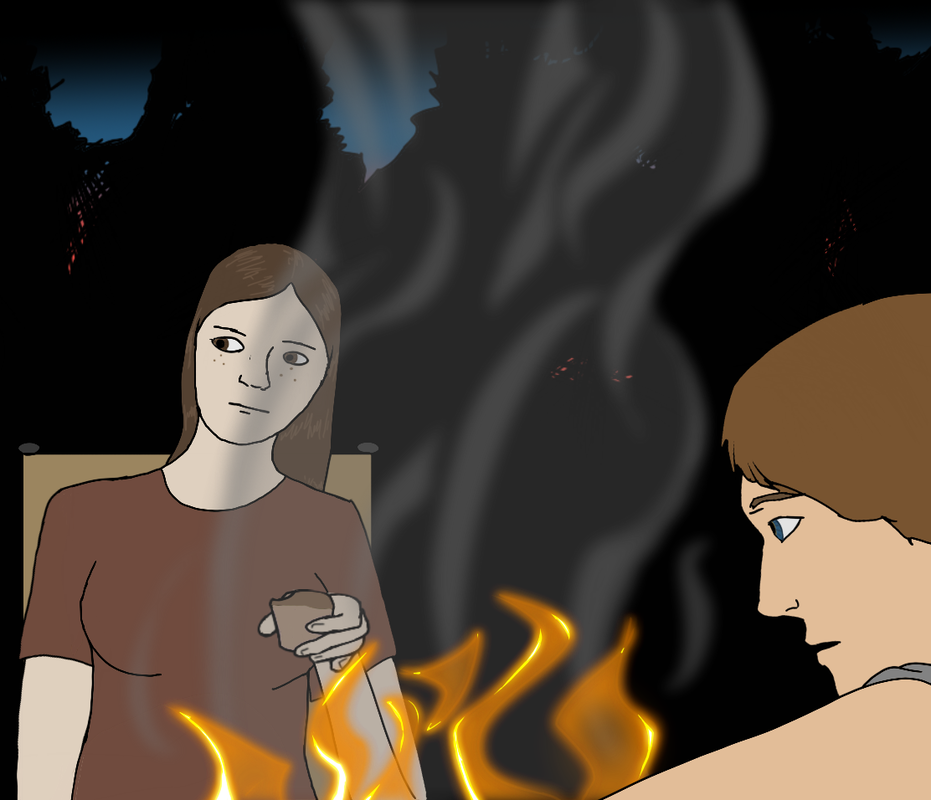
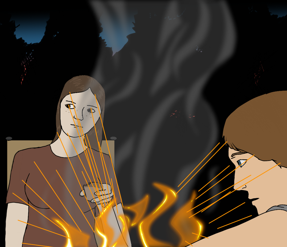
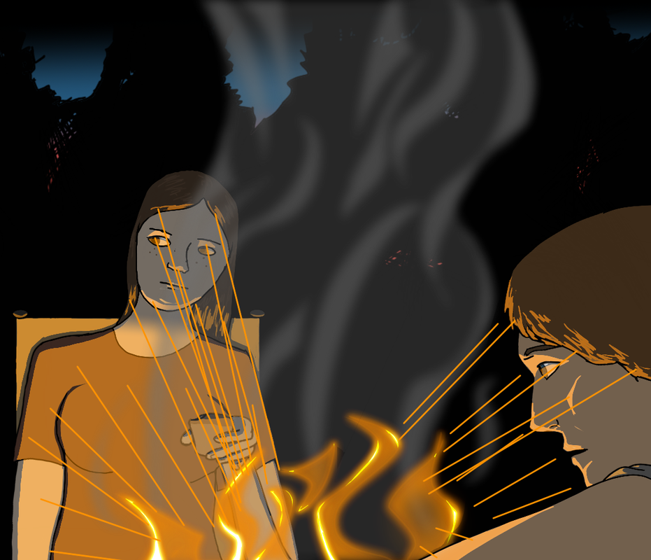
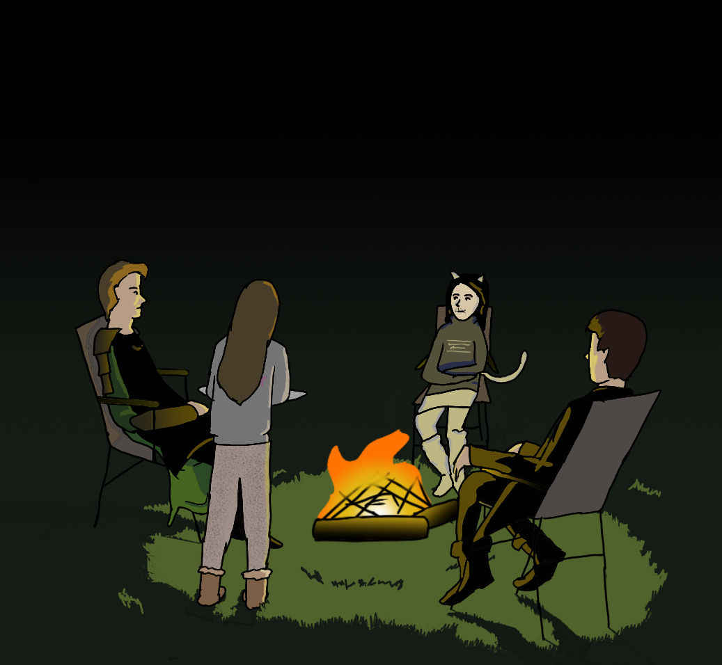
Looking at models such as these is extremely helpful when learning to draw certain things. Everyone's face is different so if you don't have a photo of a subject or a physical subject in front of you, it can be useful to look at lighting on different people's faces to try to determine how shadows would fall on your character's face. Highlights Tutorial When you are drawing these shadows you first have to identify what the light source is. In this example it is the campfire.
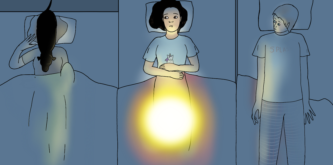
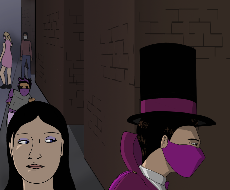
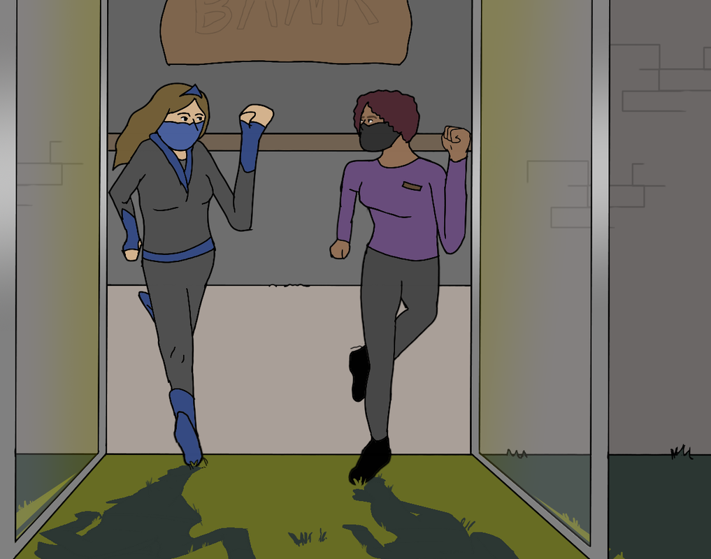
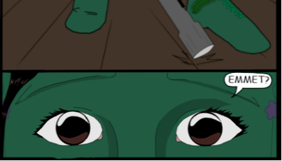
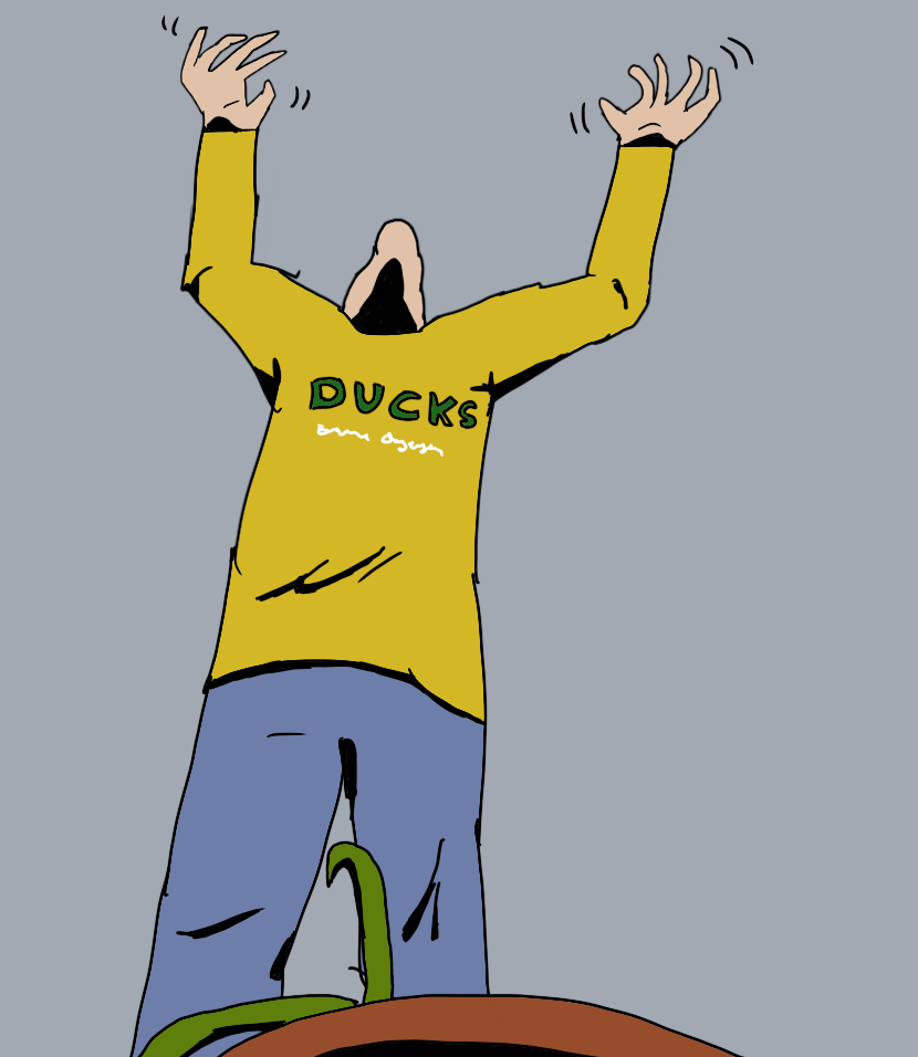
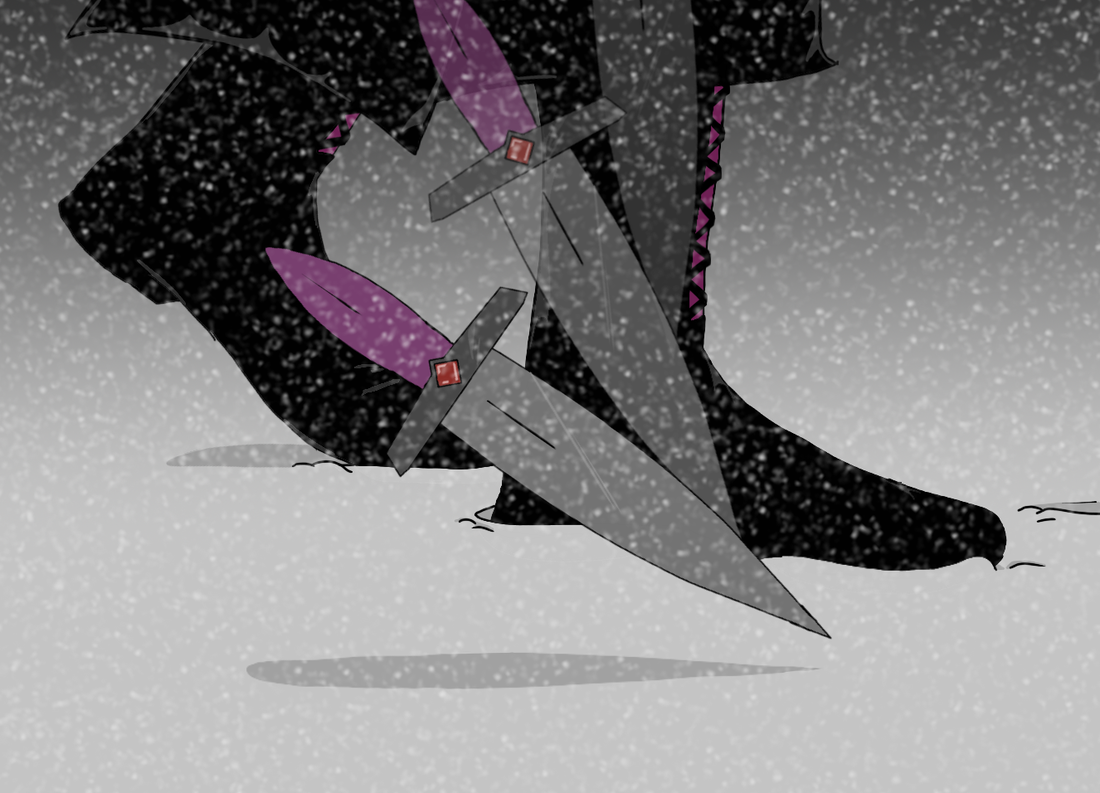
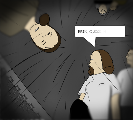
Shadows For shadows it's a similar concept. The difference is instead of where the light is hitting it's where the light isn't hitting. When you have a single light source it's easier to track shadows as they are mostly where the highlights are not with perhaps a small mid-tone section. However when you get more lights, such as a normal lit room or outside during the day, it's harder to place them. This becomes instinct with time, but one trick is to think of them as in the opposite place as you put your highlights. They also show up under obstructions like hair or a sleeve or the brim of a hat. Check out this example, also from my comic strip.
I hope this has been helpful! See you for the next post in a few weeks!
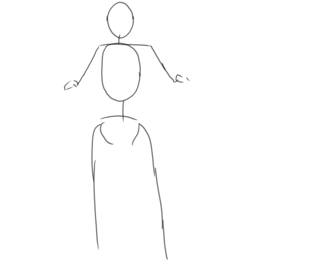
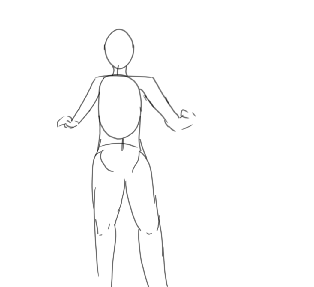
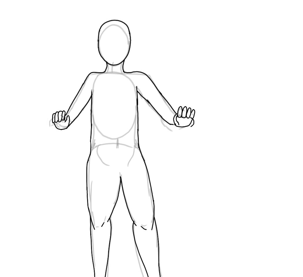
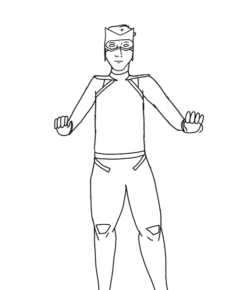
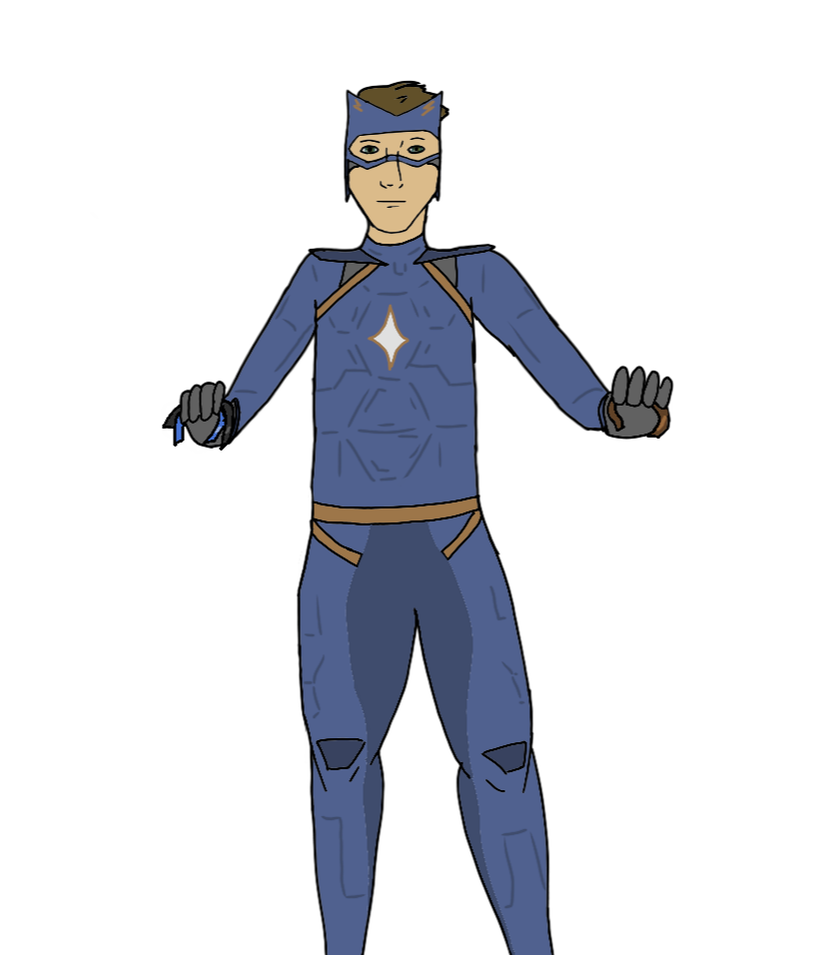
When drawing action poses I found the easiest way to draw realistic positions and actions is through drawing the base structure with action pose sketches. How To I like to draw this pose structure where I draw oval-like spheres for the head and torso (the torso sphere is a little distorted (see picture below)) with a line connecting the head to the torso. I use a half sphere for the hips. I I draw a line across the top of the torso oval for the shoulders as sort of a hinge. I then draw the arms and legs as lines extending outward from the shoulder line or the hips. I like to suspend the top of the legs slightly outward from the hips. I like to draw small circles at the knees and elbows to show myself where they are. Keep in mind that these are three dimensional. These shapes aren't going to be the same at all angles. 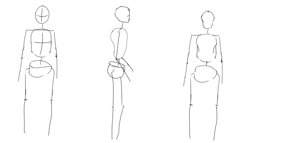 Step By Step
There are three types of shadows I'm going to cover in this piece: long shadows cast on the ground, shadows cast on the face from different light sources, and dark, dramatic shadows. Long Shadows
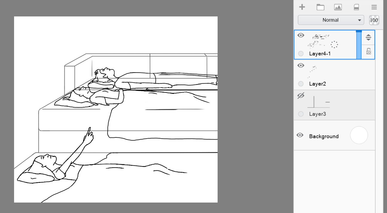
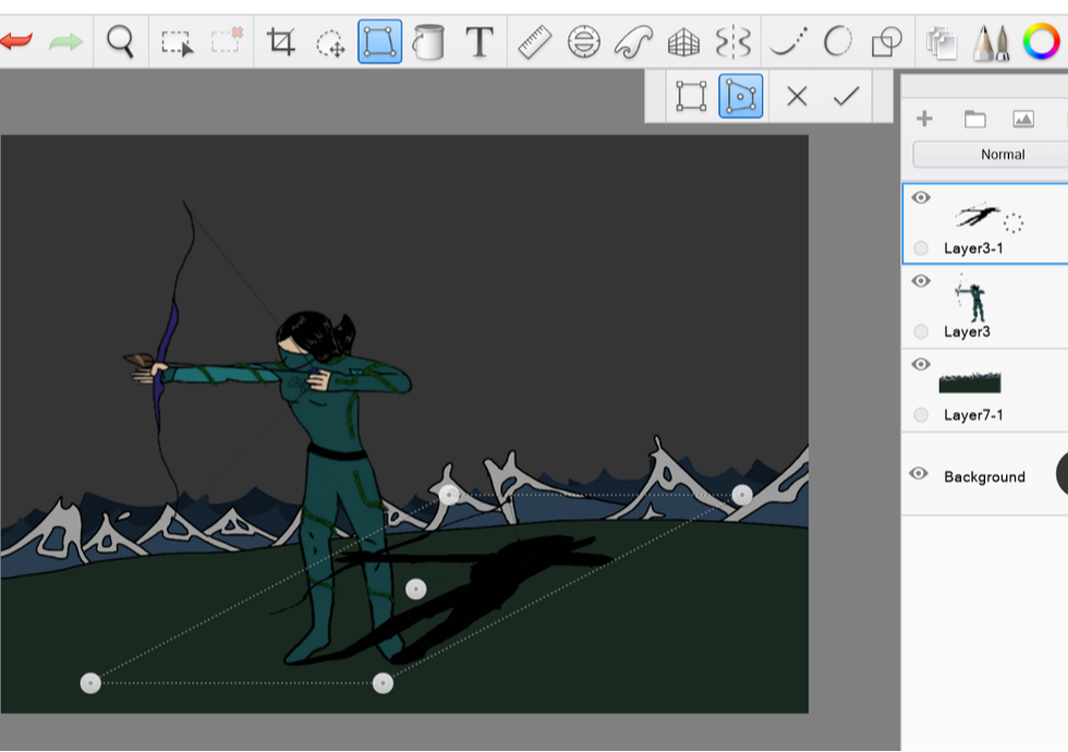
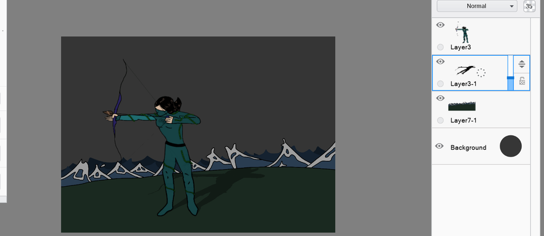
 Tricks for drawing long shadows Because it can take a while to redraw the subject to give them long shadows (or reflections), I often use a shortcut. I use the layers feature of many digital art softwares.
Step 5: You can also add the light source This is not necessary, but adding a light source or other shadows can make a scene look more realistic. Another way to show this is to add more long shadows from other objects.
Shadows on Faces
Dark Shadows
 In this post, I am going to talk about some of the tips and tricks I learned doing digital art. Software and Technology
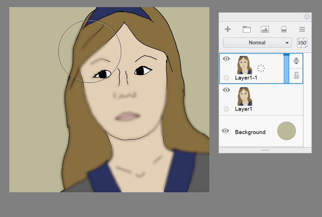
The BasicsOn many digital art softwares, you are going to have many different tools available to you. You have many different types of brushes with different shapes, textures, blending, and other effects. You also have layers to your drawing. You can change the transparency and blending of these layers, which can be a really useful tool. LayersLayers are a really useful thing about digital art that you can't really get on paper. Layers are useful for when you want to draw a foreground and a background which you may want to adjust and move around. Having parts of your drawing on different layers allows you to move parts around over top of others without having to erase the lower layers. They are also really useful for shadows and lighting. Often I will draw shadows and special lighting on a semi transparent layer above the subject so I can change it more easily later if I want. Layers are also really useful if you're going to have a very full foreground with something like rain, snow, or dust. That way if you want to change part of the midground you don't have to try to erase all the drawing in the foreground and then try to redraw it to match. It is much easier if you use layers so you don't have to try to mess with things you drew in other layers when you only want to change one thing which is in another. Layers can also be useful if you want to use one of the drawings more than once. You can often duplicate layers that way you don't have to redraw what you drew.
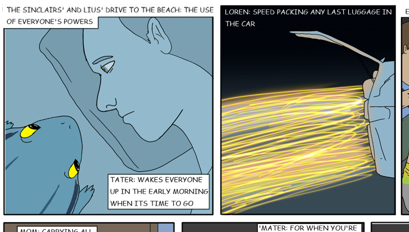
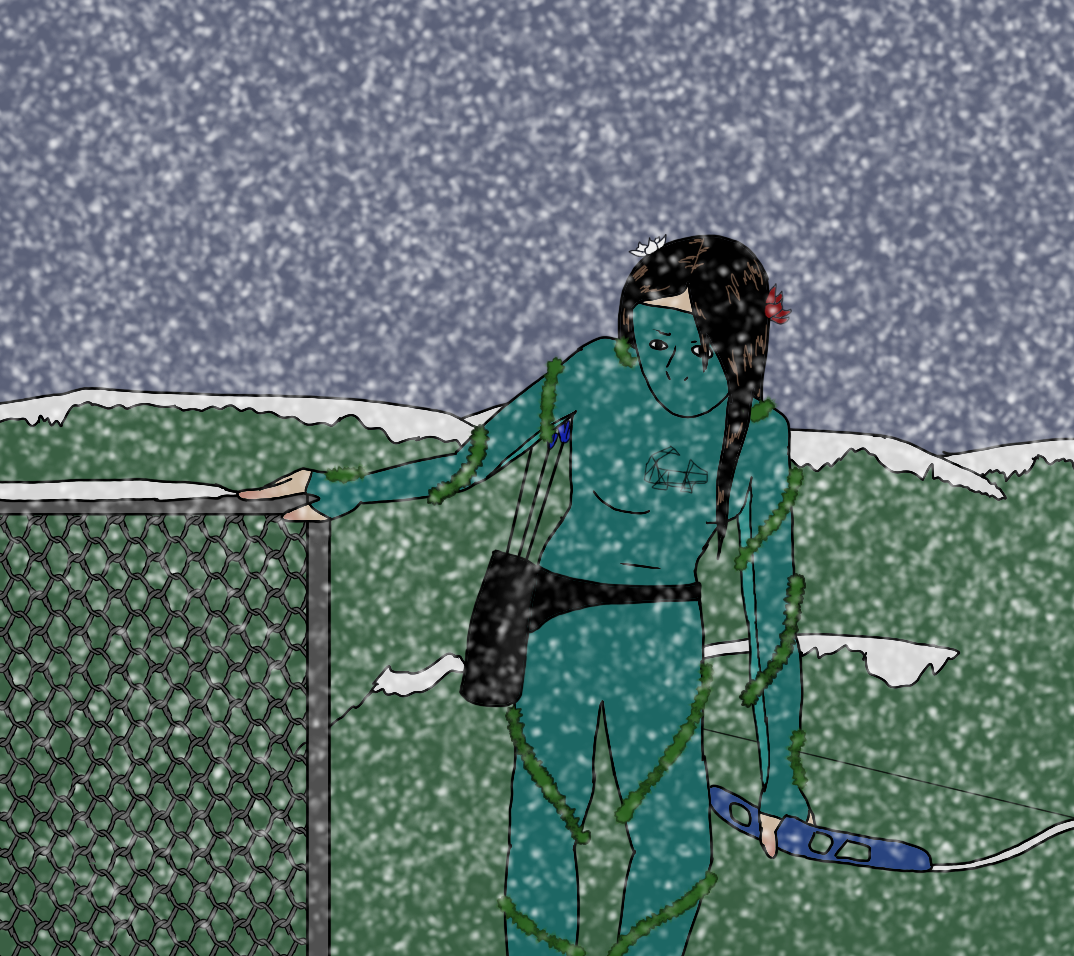
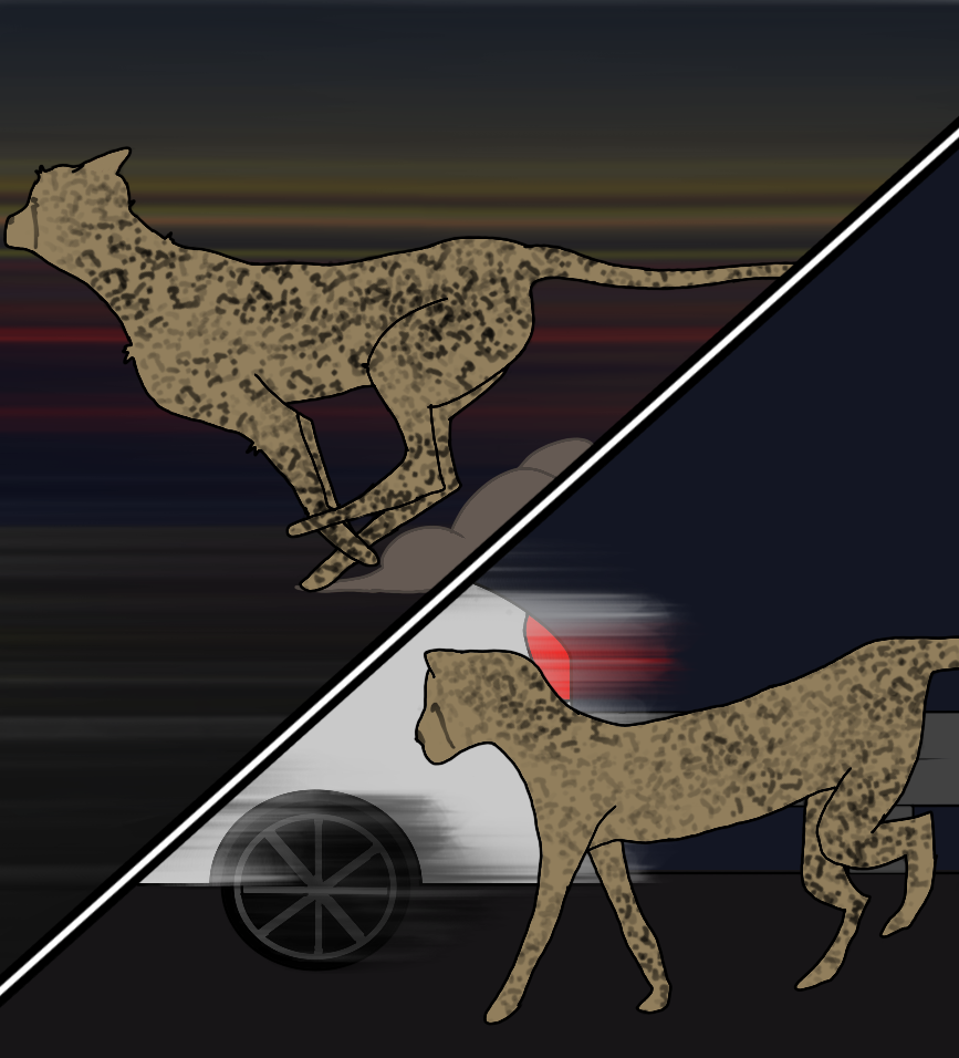
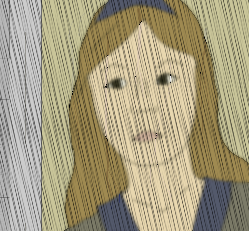
From left to right: using transparent and duplicated layers; Using layers to have multiple overlapping midgrounds; Using layers for shadows; All created by me Brush TricksSometimes there is a brush that draws exactly what you were needing without all the time it takes to draw it. For example, drawing snow dot by dot would be really hard, but if you use a dot brush you can do it really quickly. The software I use (Sketchbook) has some nice brushes for drawing vines too, which I use often in my comics. Dot brushes are also useful for drawing spots. I also really like to use blending brushes to draw lines to indicate motion and speed. I also really like using the blur brush to create different effects such as focus or gradients. Sometimes hatching brushes can be sued to create lines to indicate rain (as shown in Rain on Window Tutorial Below).
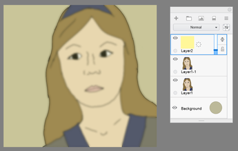
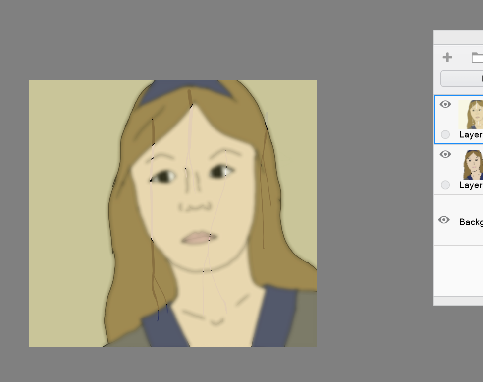
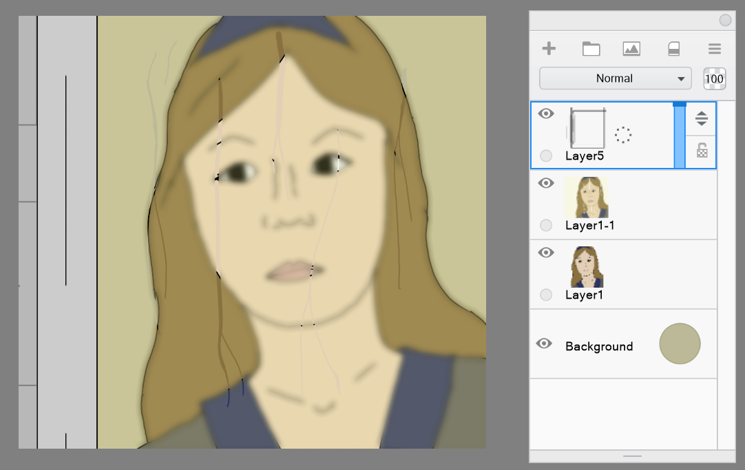
From left to right: Example of using brushes to draw snow and vines; Used dot brush in conjunction with an eraser to create spot patterns on the cheetah as well as a blending brush to indicate speed; Used a blur brush to create a blur affect around the edges; All created by me EffectsUsing digital art tools, you can make really cool effects using certain brushes and layering. Here is one thing I like to do: Rain on Window I really like the effect of rain rolling down a foggy window. Here's how I do it: Step 1: Draw the scene behind the window.
Step 2: Duplicate the layer and blur the duplicate
Step 3: Create a semi transparent layer of a light yellow
Step 4: Merge blurred layer and transparent cover layer. Now you can use the eraser to draw drops of rain by erasing the top layer. (Tip: vary the size of the brush to create different sized streams of water)
Step 5: Draw the window frame and outside wall on another layer
Step 6: Draw rain on the next layer! (I like to use a hatching brush as it draws many diagonal lines; you may need to increase the size of the brush a lot to make it look like rain)
I think I may do more tutorials for tricks like this in future posts. Let me know what you guys think in the comments! Also let me know if there are any other things you would like me to write about in future posts. Image Credit
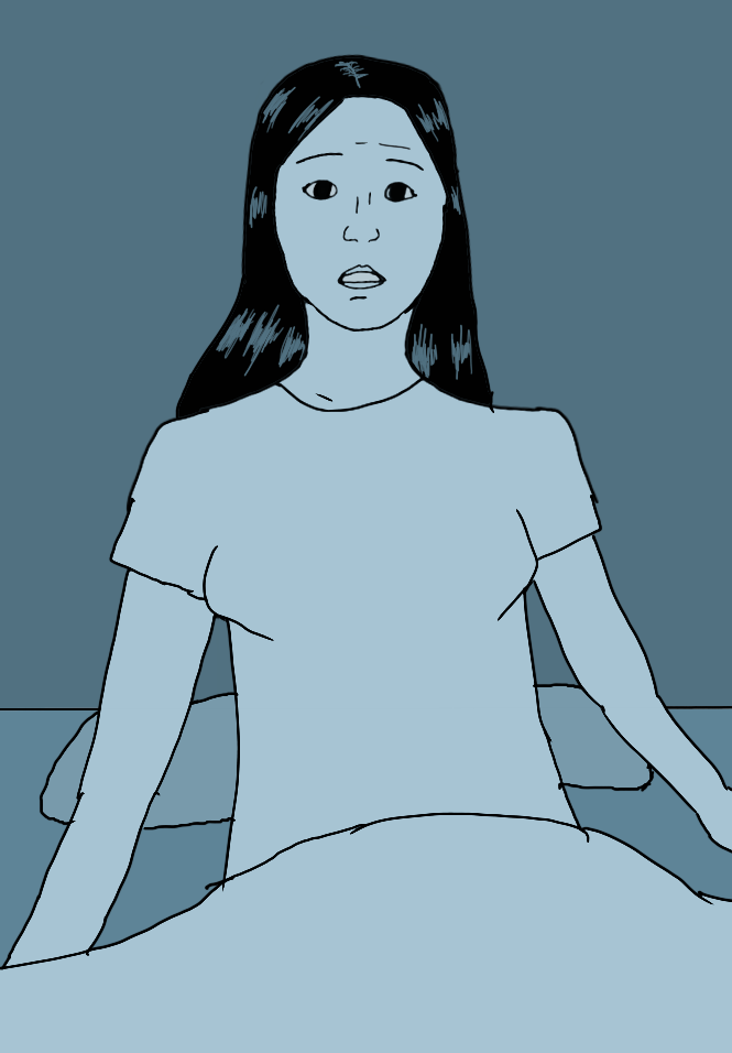
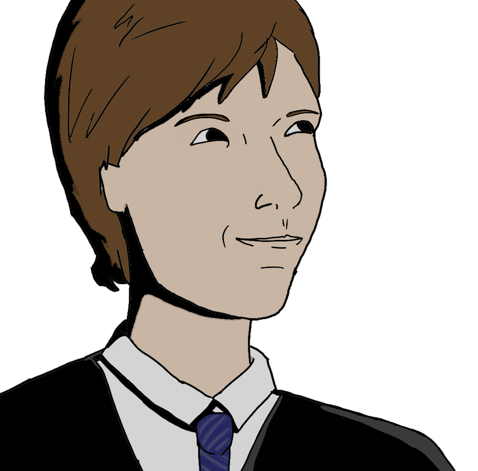
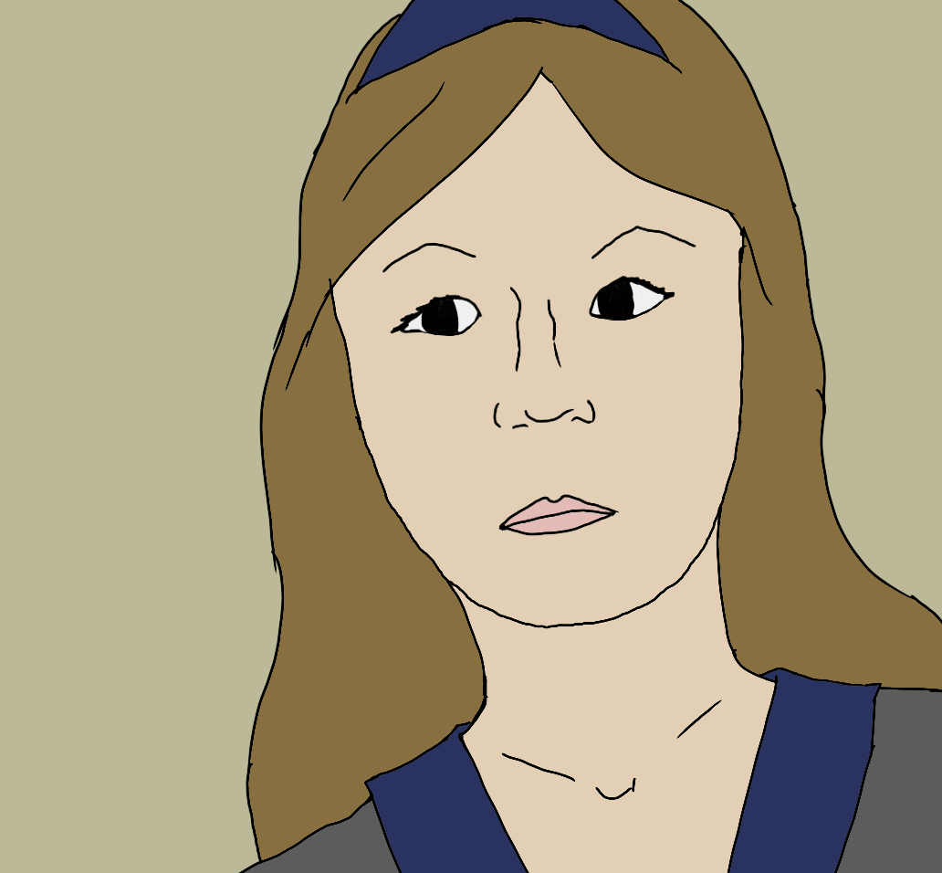
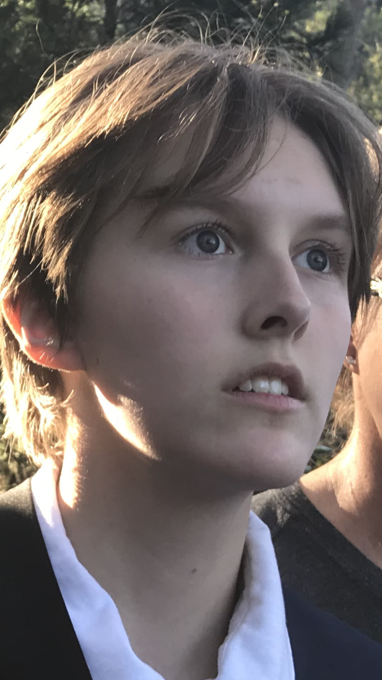
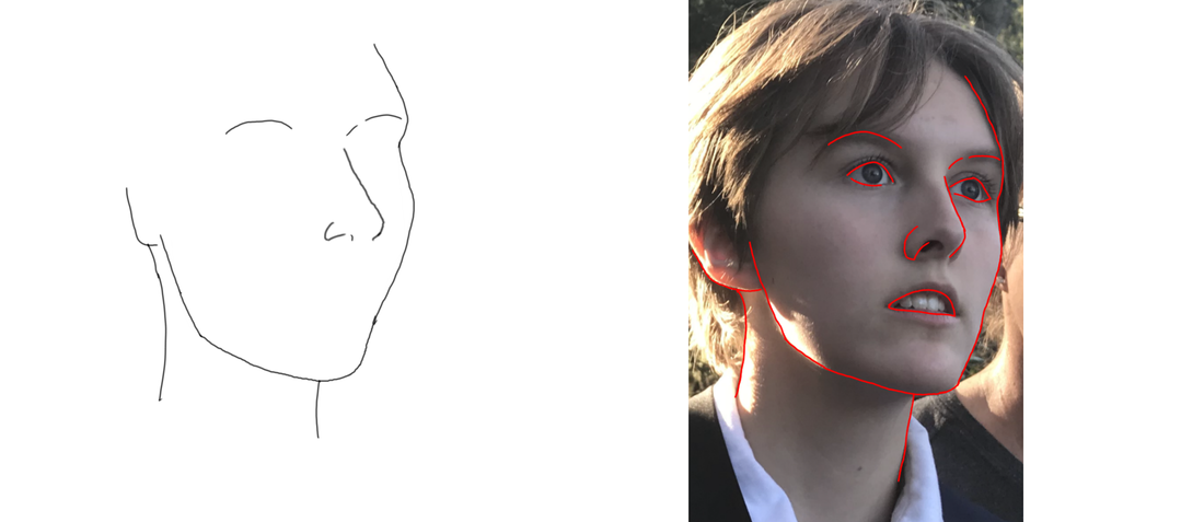
I think my strongest drawing ability is drawing faces. Here is my advice on how to draw them. Step 1: Get a photo of your subject
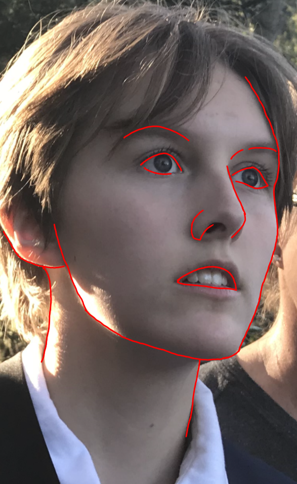
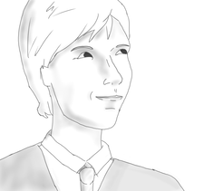
Step 2: Identify and draw the major lines
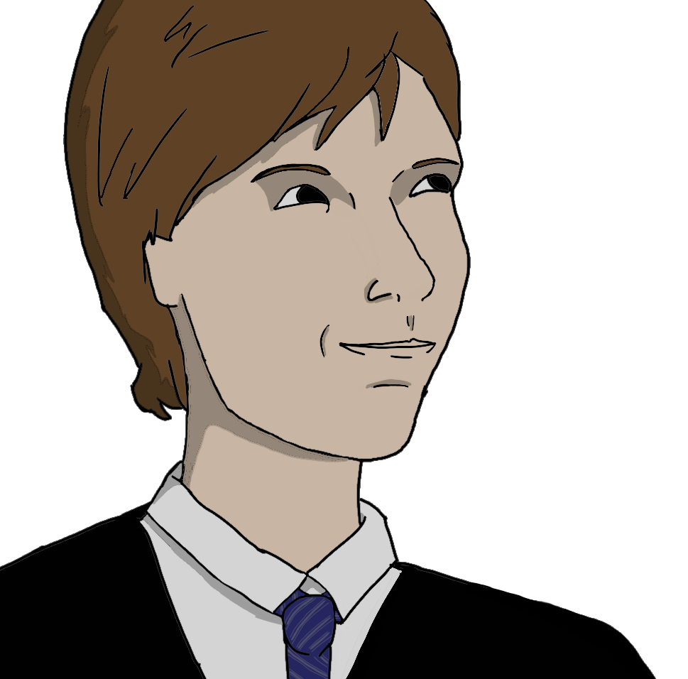
 Step 3: Add in other features This is where I draw in the eyes and the mouth. You can also add in other minor facial details here. 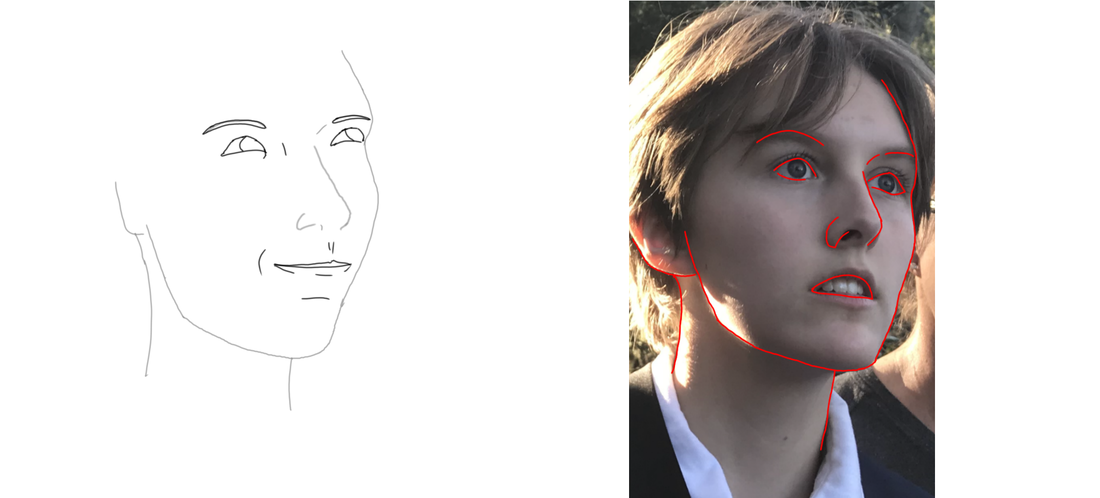 Step 4: Draw in the hair and clothes The hair and clothes are much freer than the facial features. Hair moves and clothes have unique wrinkles. You don't need to base this off of the photo, however if you aren't yet familiar with drawing clothes and hair then you may want to draw the shapes of the locks of hair and the wrinkles and folds in the clothes as they appear in the picture. 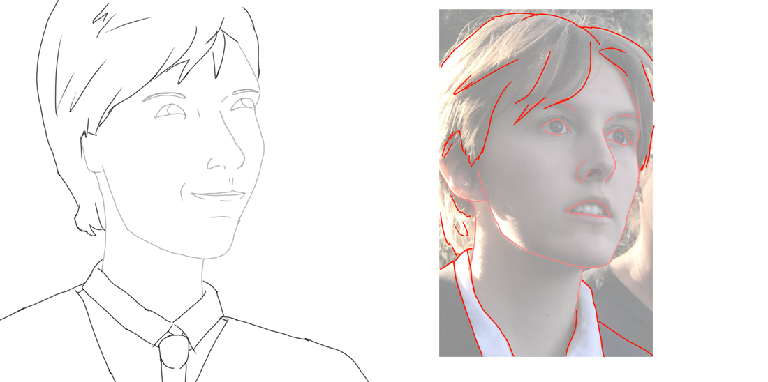 As you can see I didn't draw the hair and clothes exactly as they appear in the picture, but I did take inspiration from their general shapes in the photos. Step 5: Final details and color Add in your final details to your drawing and color it! Depending on what style you're going for, you might want to color it in different ways. Here are a few.
For more on faces, I learned a lot from Christopher Hart's books Figure It Out: Human Proportions and
Figure It Out: The Beginner's Guide to Drawing People. |